HydraPak Packaging

ART DIRECTION
/
Branding
/
Packaging
Case Study

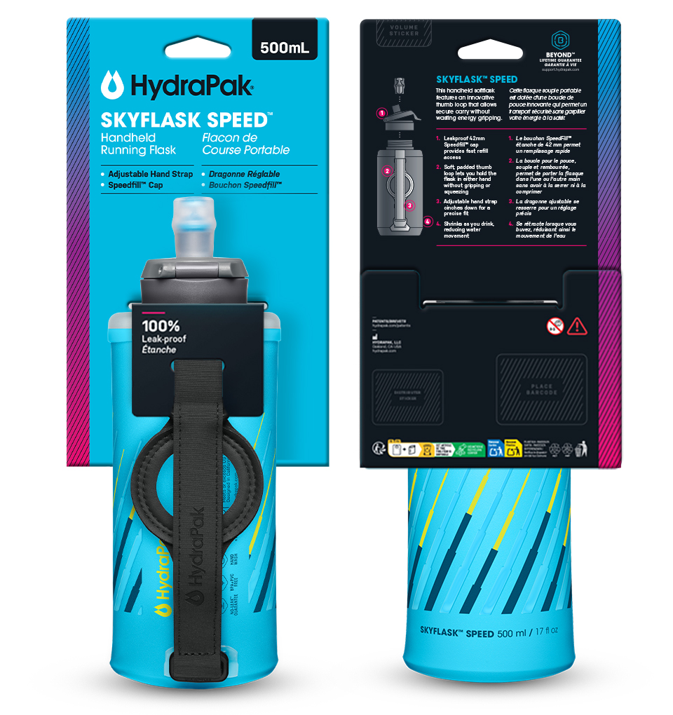
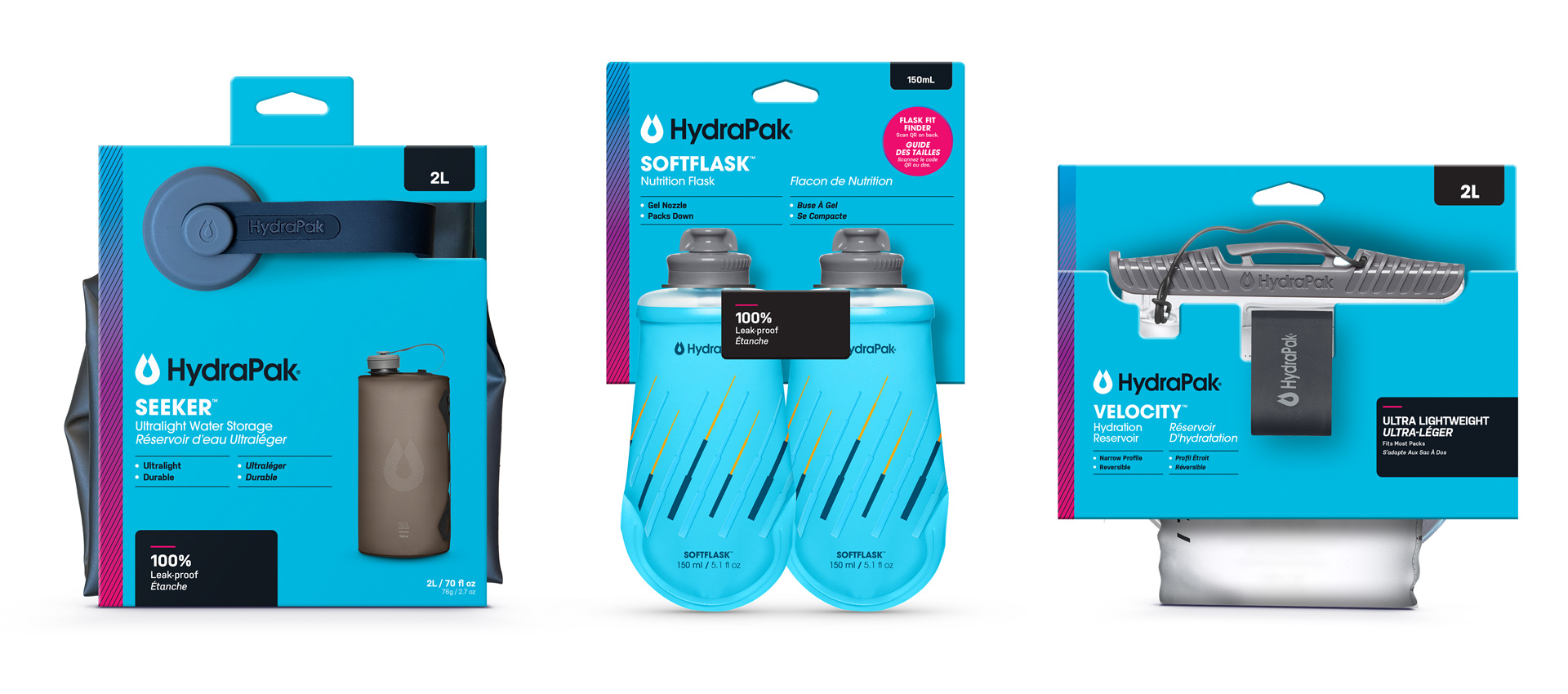
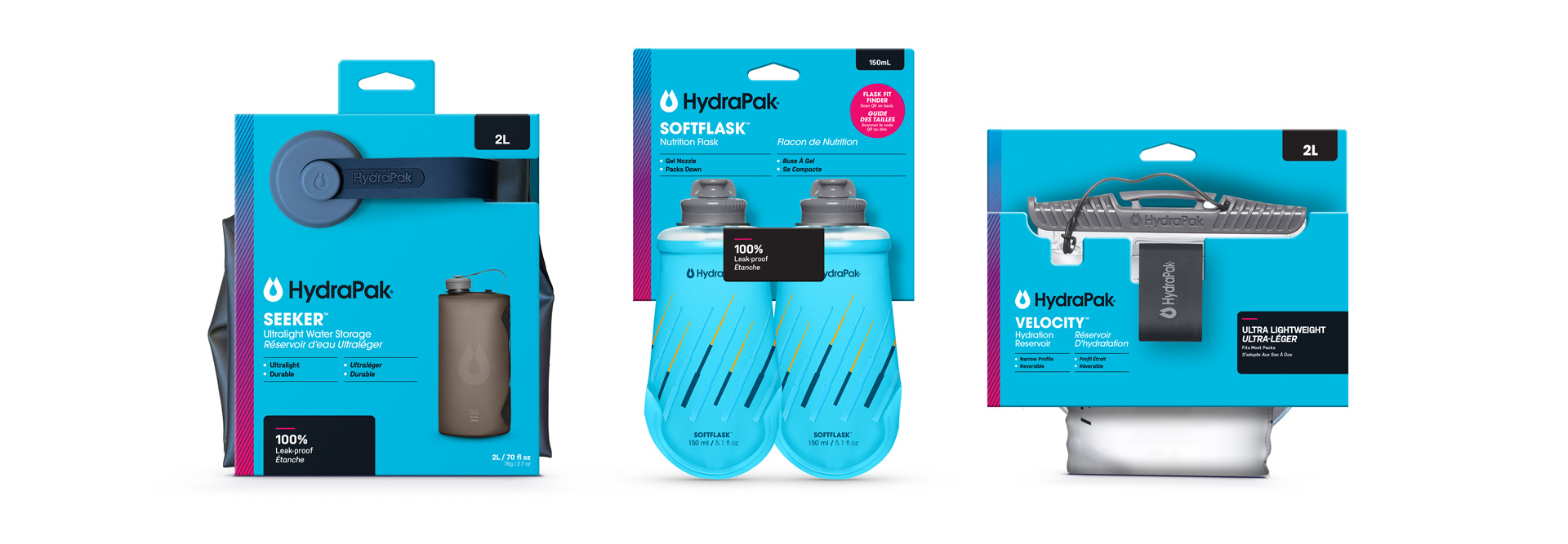
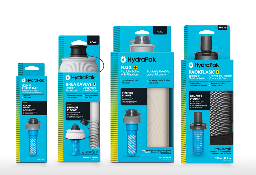
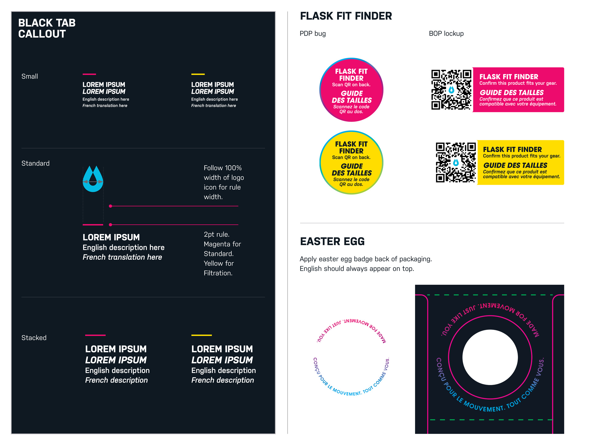
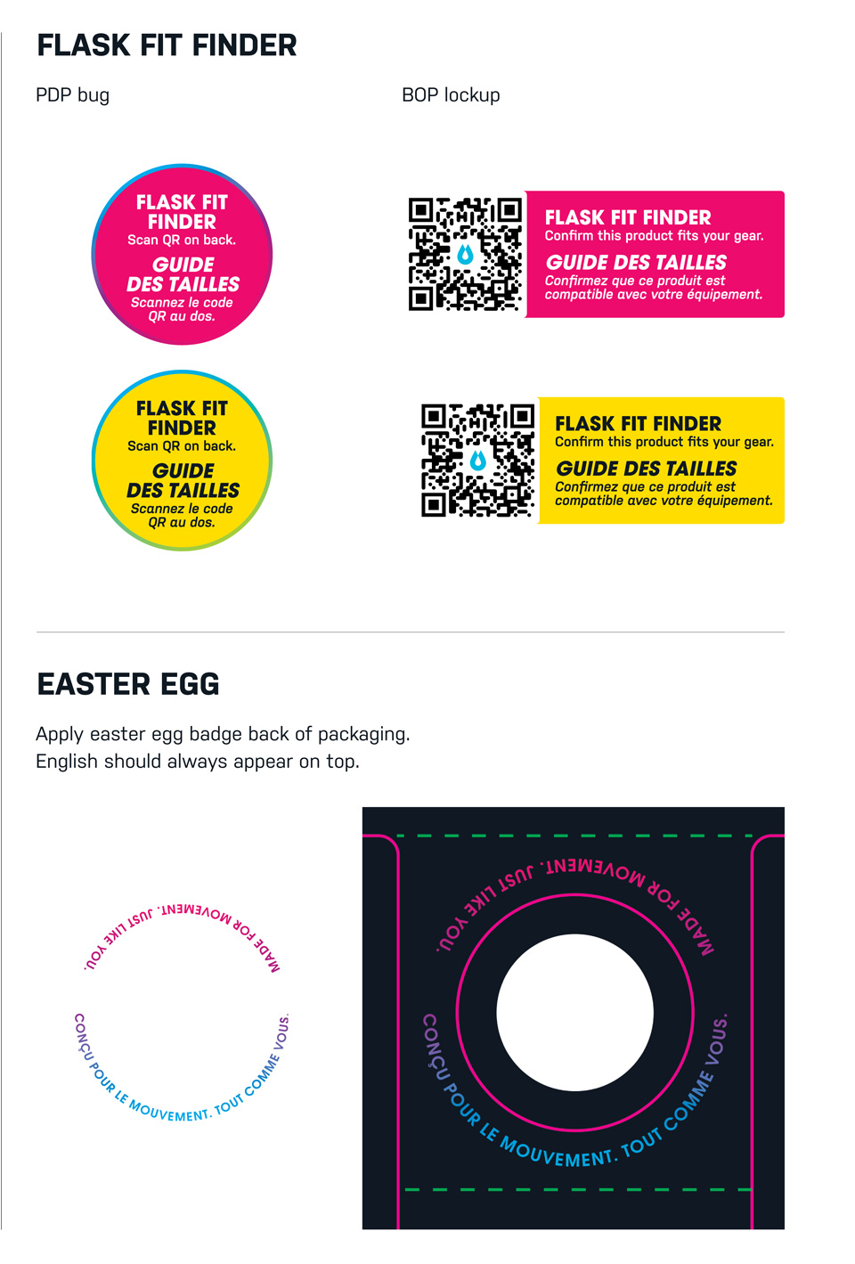
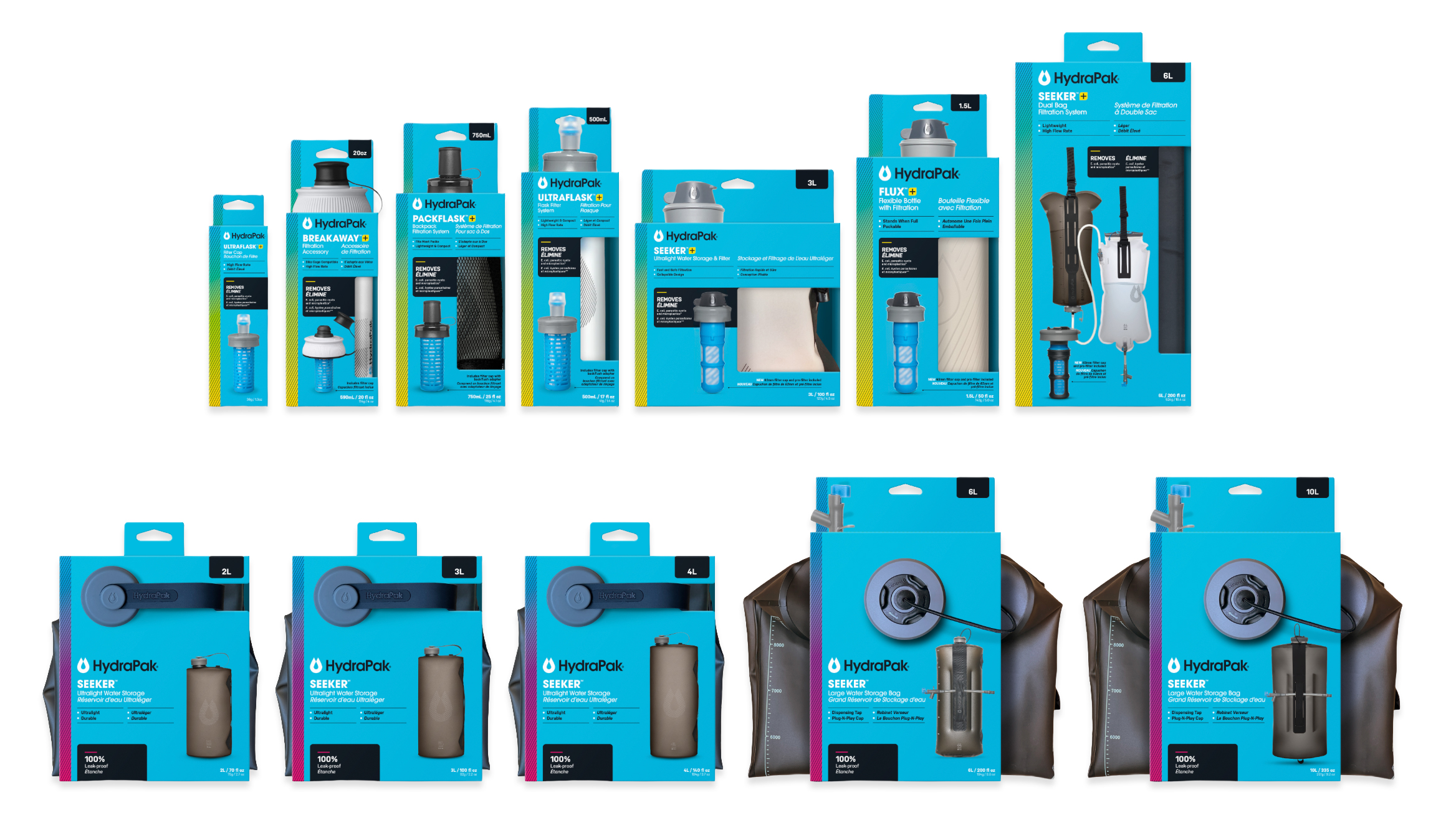
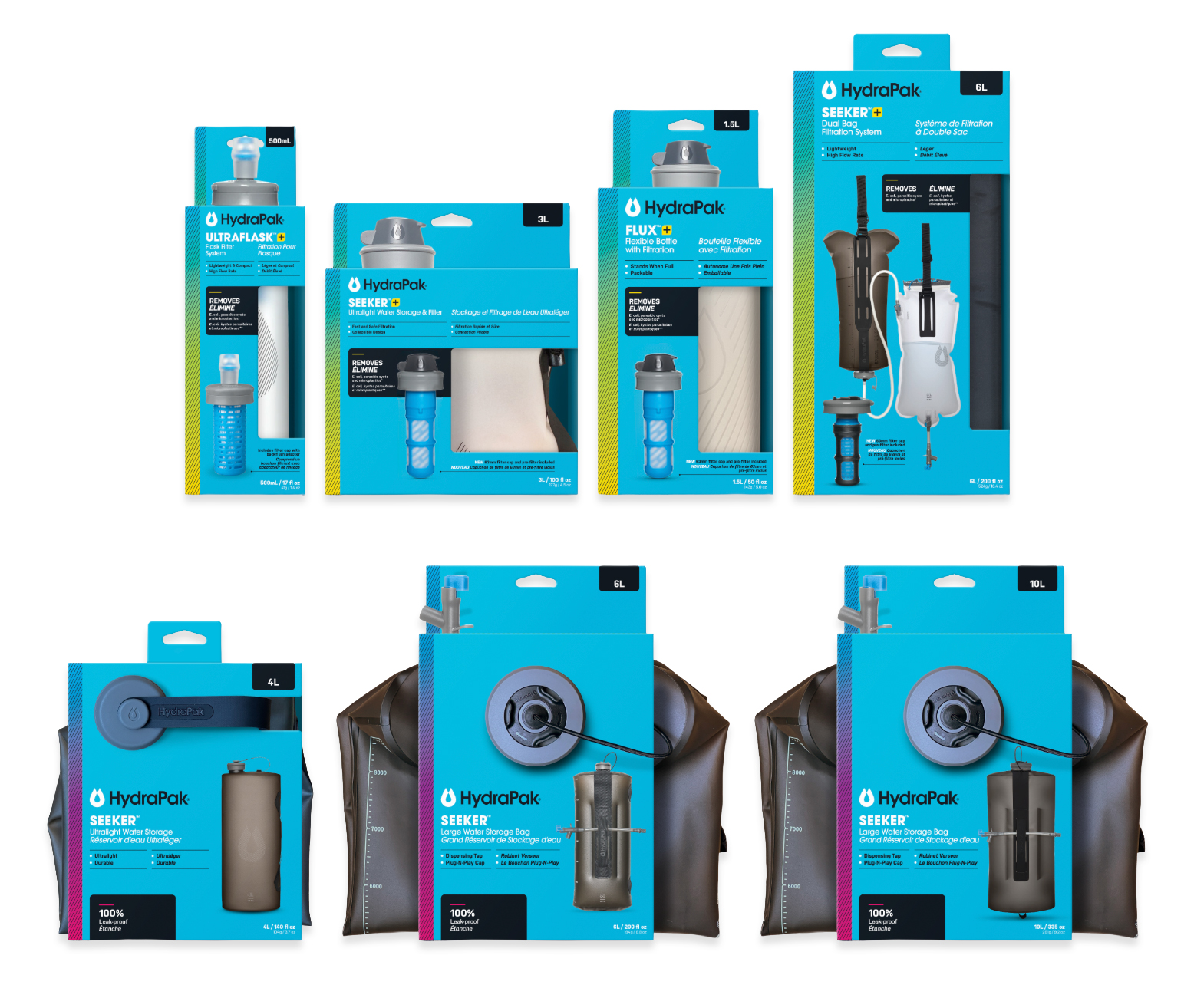
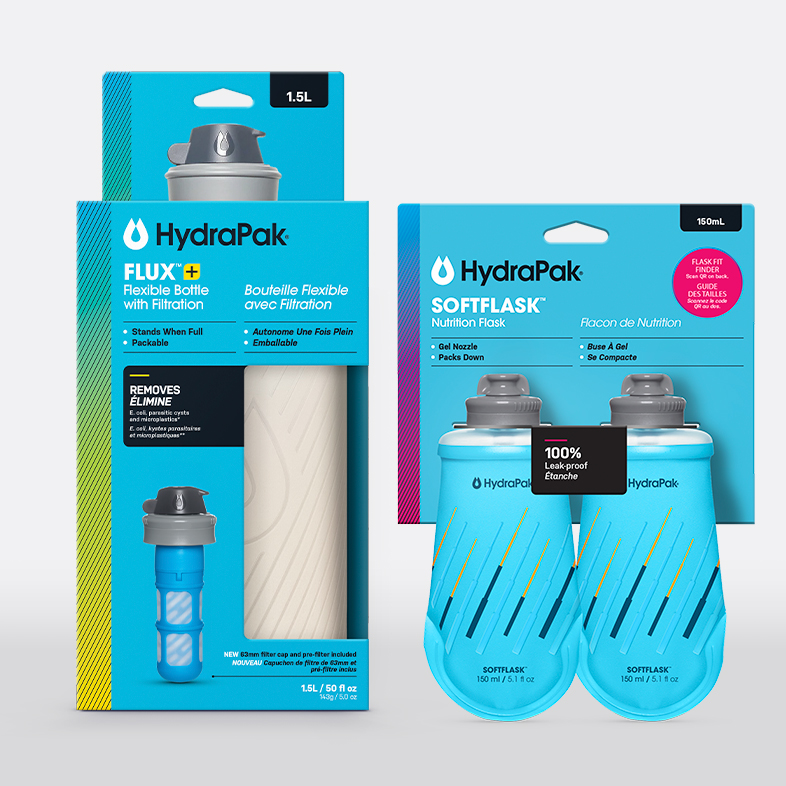
A 2027 full packaging redesign developed to meet new General Product and Safety Regulations (GPSR) while creating a more cohesive brand experience. New dielines and creative were developed across nearly 70 products, integrating equal English and French translations while maintaining clear hierarchy and strong shelf presence.

Role
Art Direction & Project Lead
Goal
Strengthen shelf distinction, improve product communication, and create a scalable packaging system.
Agency
Moxie Sozo, Boulder, CO.

Packaging

Project Objective

Redesign

THE BIG PICTURE —

Evolve the existing HydraPak packaging to instantly communicate its superior performance to consumers in-aisle.

Assess the brand’s current retail performance across categories and establish hierarchy improvements based on category purchase drivers.

The PROBLEM —

Gear selection is personal. How do we better connect with customers beyond function? What drives them?

Whether you're charging a summit or ticking off miles, Packflask is hydration that moves with you.

THE NEED —

How do we improve product understanding at retail while also adhering to the General Product Safety Regulations (GPSR)?

Objective: Strengthen shelf distinction, improve product communication, and create a scalable packaging system.

Existing Packaging Retail Audits

In-store retail audit across four major retailers, encompassing big box, regional, and specialtyoutdoor. We observed shopper behavior, product presentation, and shelf conditions across aisles. We also conducted interviews with floor sales reps in each retail location.

Six categories observed:
hike, camp, filtration, run, cycling and impulse.

5-3-1 Test

( 5' ) Impact

At a 5-foot distance, consumers are drawn by color, form, and visual impact.

( 3' ) Define

As consumers get closer, they look to udnerstand what the product is.

( 1' ) Close

As consumers get closer, they look to understand what the product is.

Our primary focus is solving for the 3-foot shelf appeal.

Observations to consider:

  • Touch and feel are primary purchase drivers.
  • Shoppers are highly intentional and involved; clear PDP communication of attributes is essential
  • Brands who WIN are ones who quickly signal how their product fits customer needs.

Key Findings

Shoppers are focused. They don't linger in the aisle and make up thier minds quickly.

100%

touched and felt product regardless of purchase

43%

read the back panel of the current packaging

3.6x

more likely to buy after reading back panel of the current packaging

39%

30sec - 2min time in isle

51%

made a purchase

53%

made a 1:1 purchase
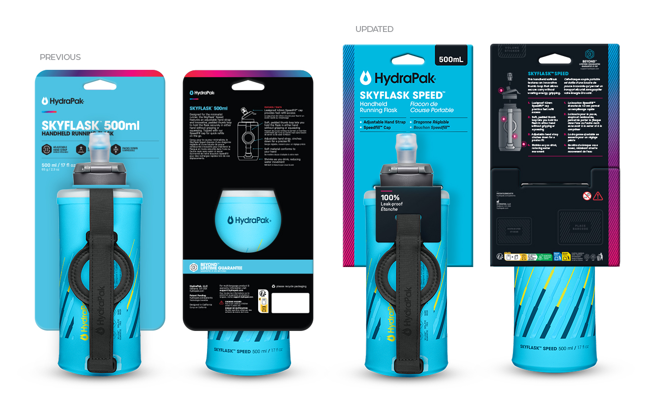
Impactful Design Improvements

  • Enlarged capacity callouts helps with identifying the product type.
  • Logo is more prominent.
  • Larger, sentence case statement of identity for quicker comprehension.
  • Key product drivers are not blocked by product.
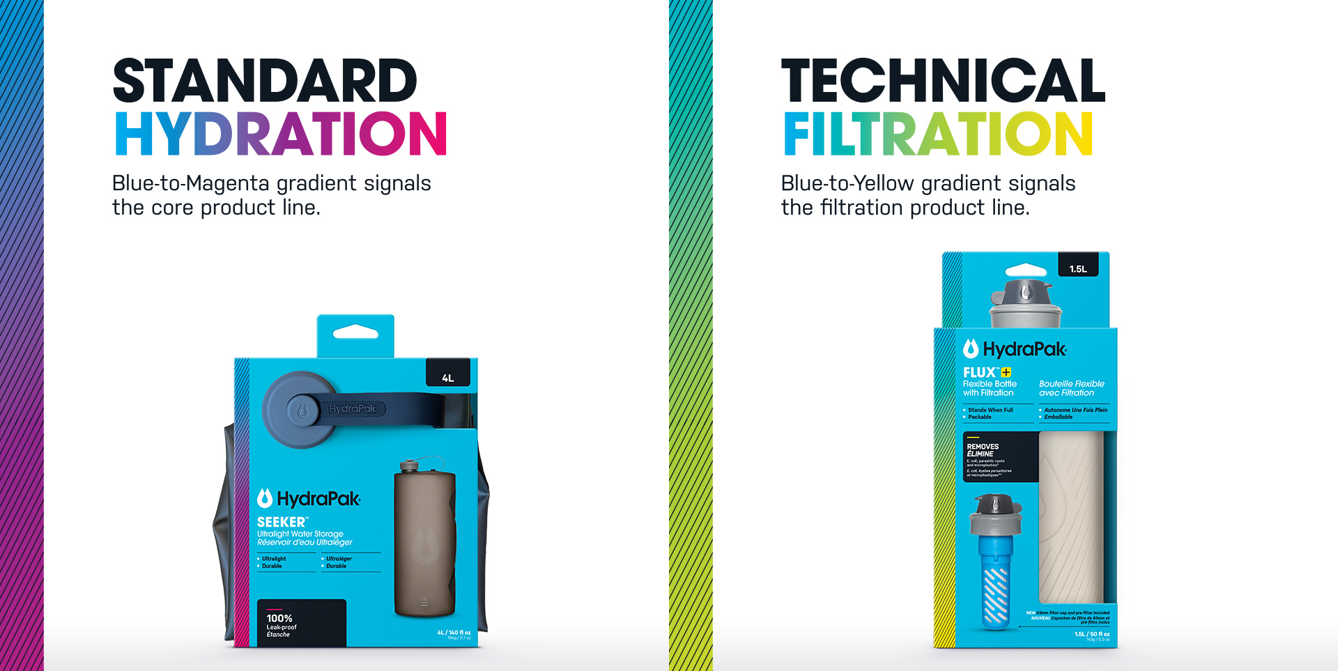
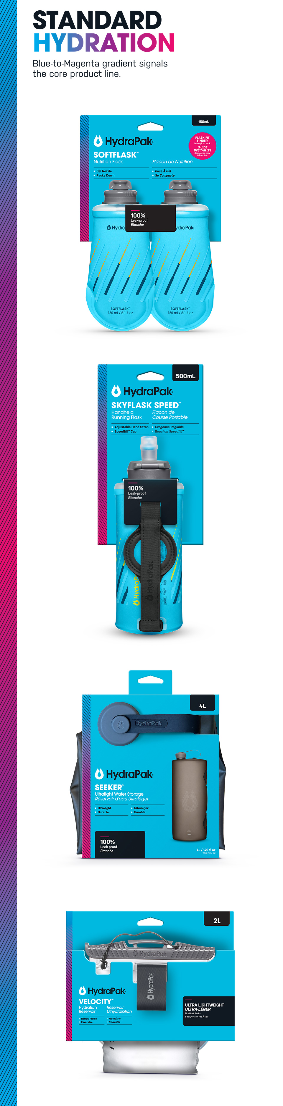
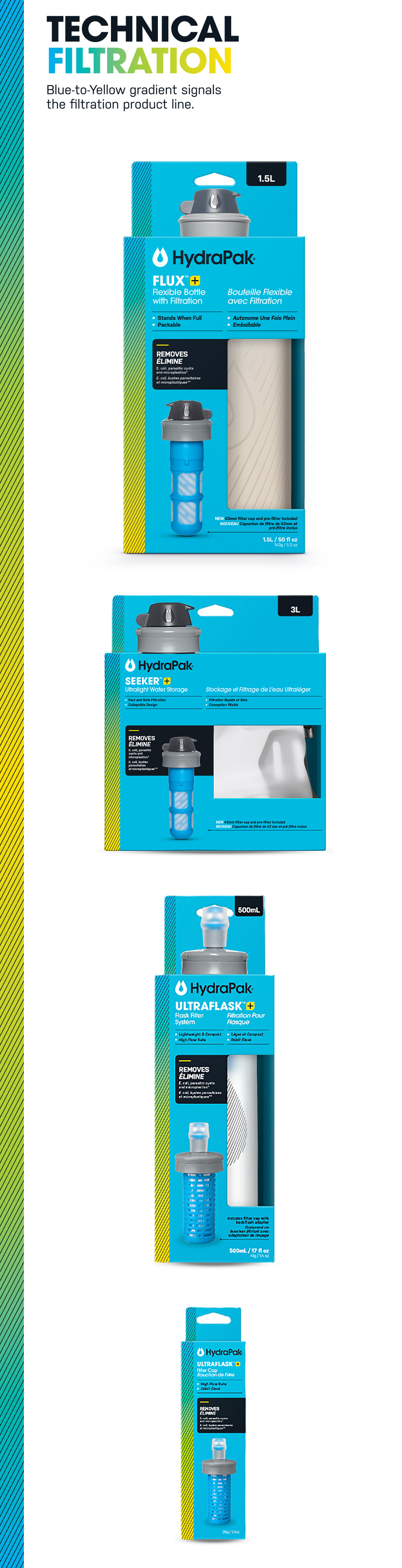
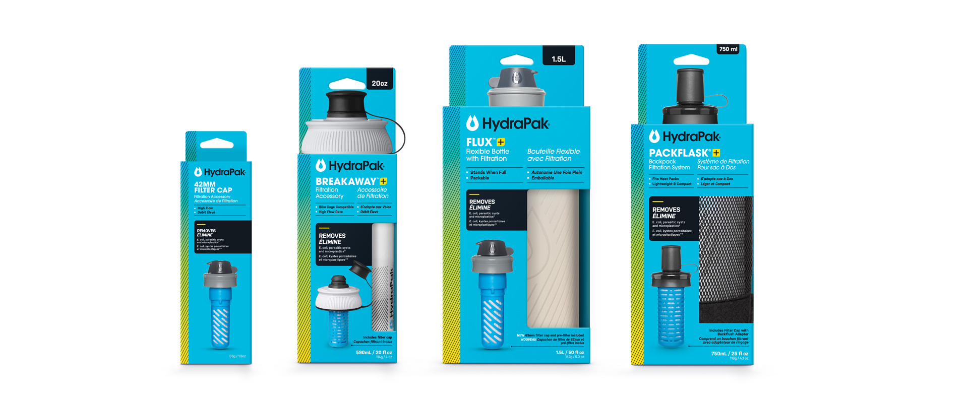
  • Enlarged the gradient bar to help define the core product line.
  • Make sure that the key benefits are legible and catching the shopper's attention.
One Stystem. Two Pillars.
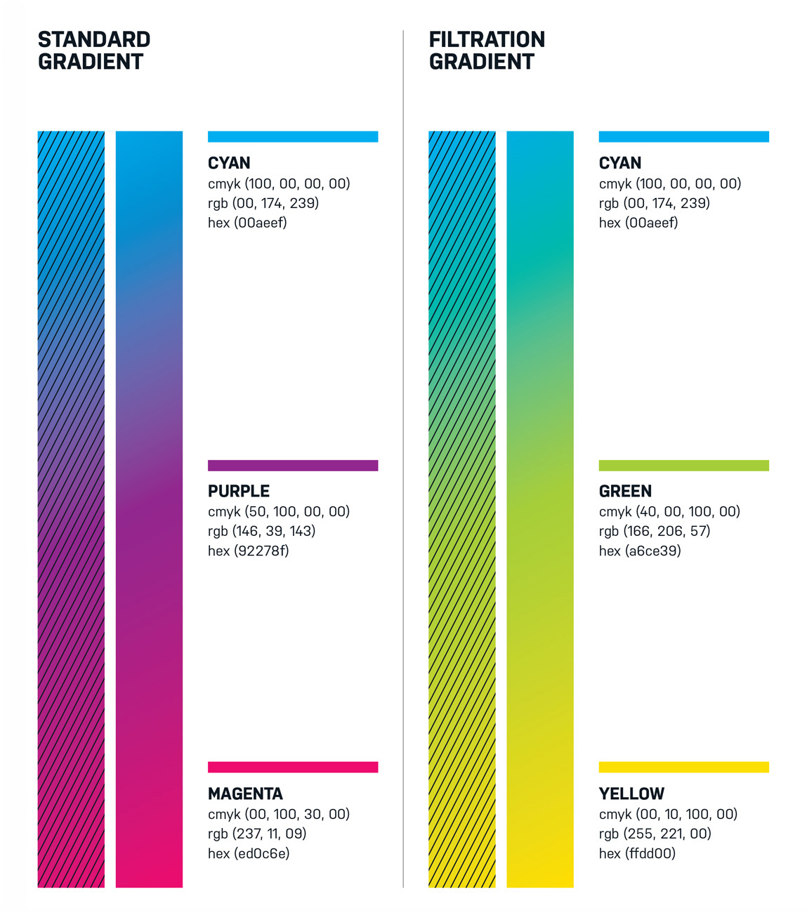
The HydraPak system utilizes a dual-gradient strategy to simplify the decision-making process at shelf. Segmenting products by their core function, the system creates a clear path to purchase.
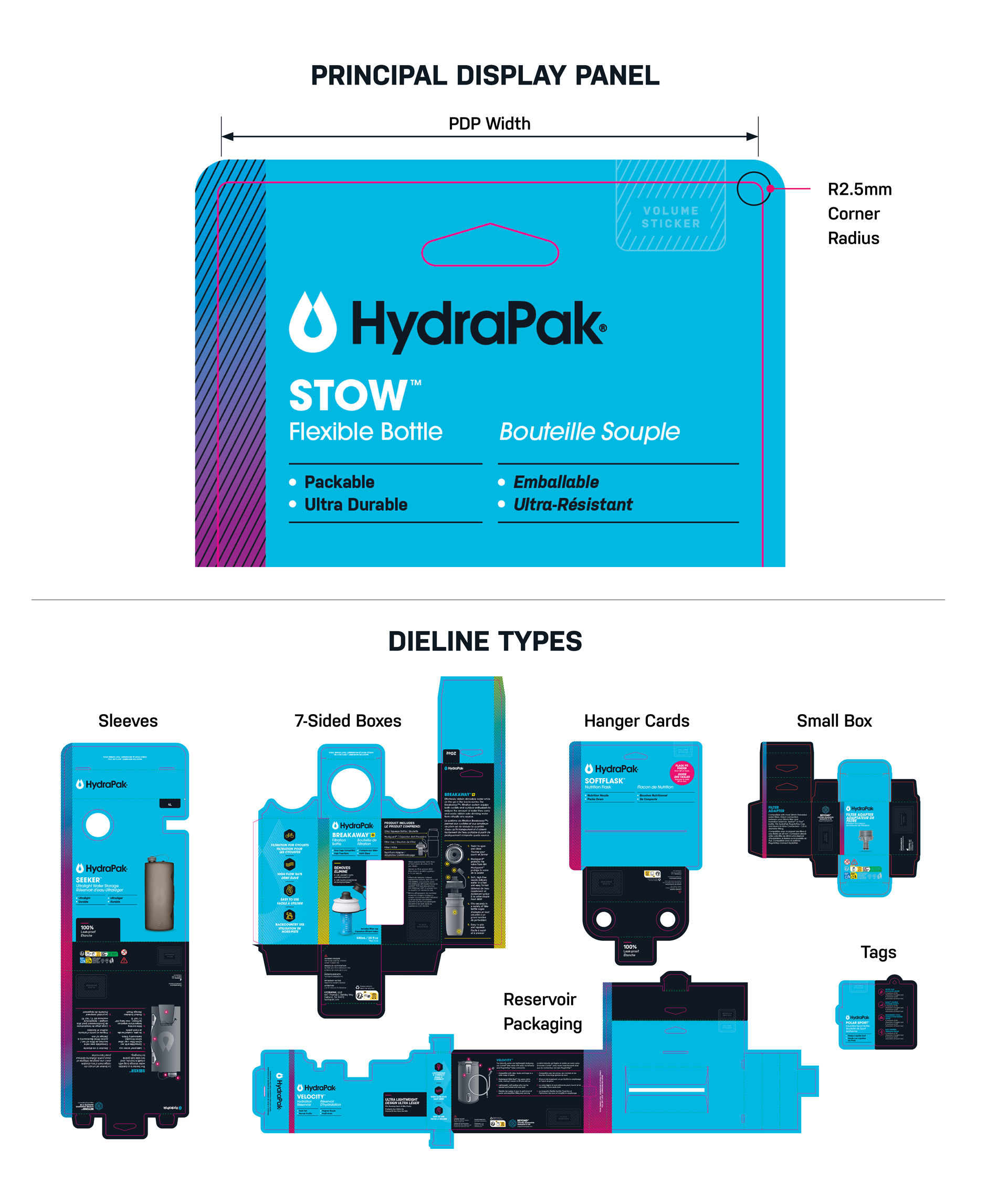
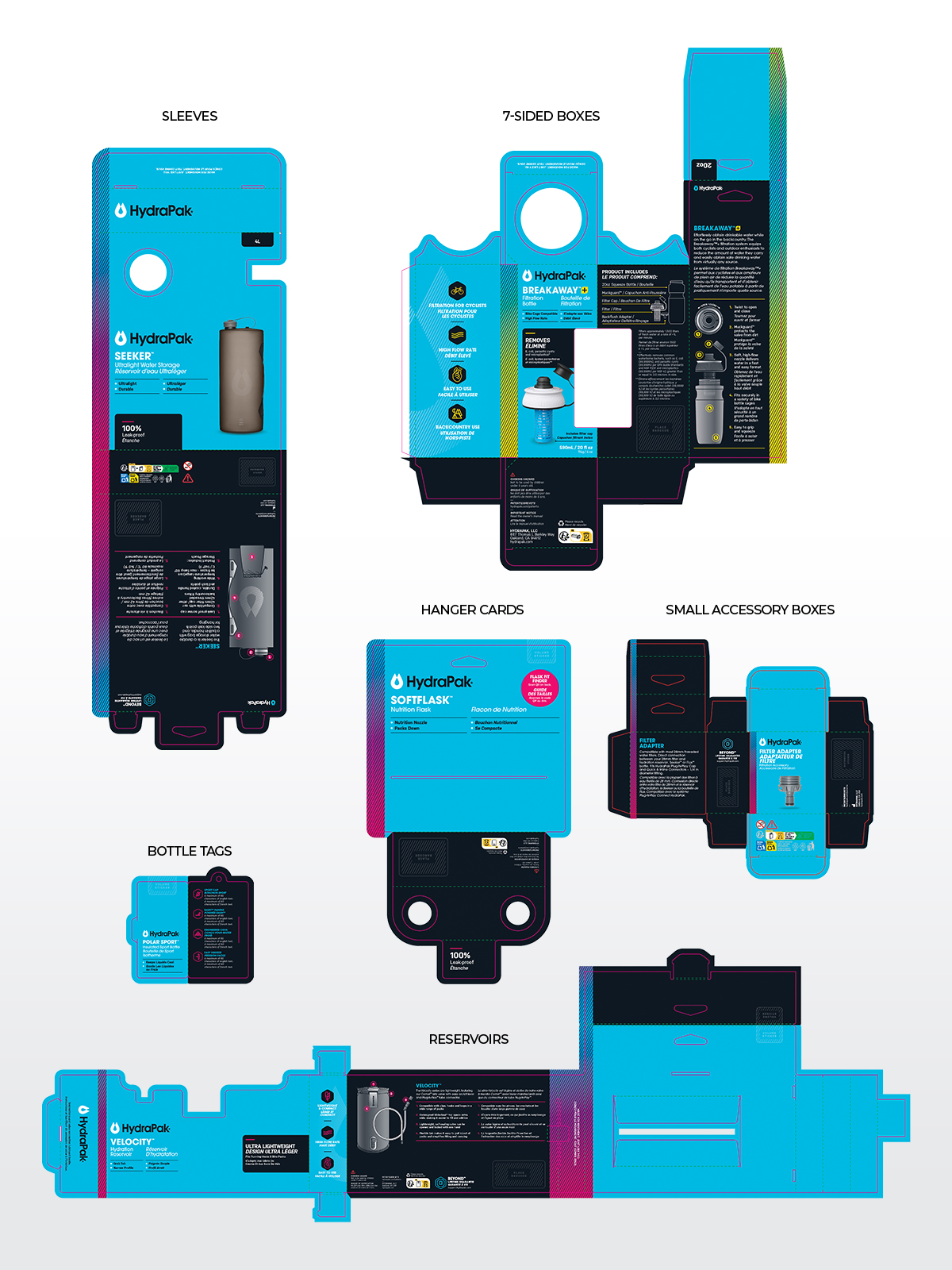
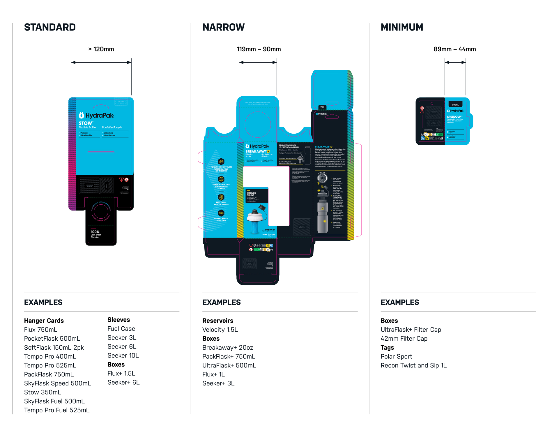
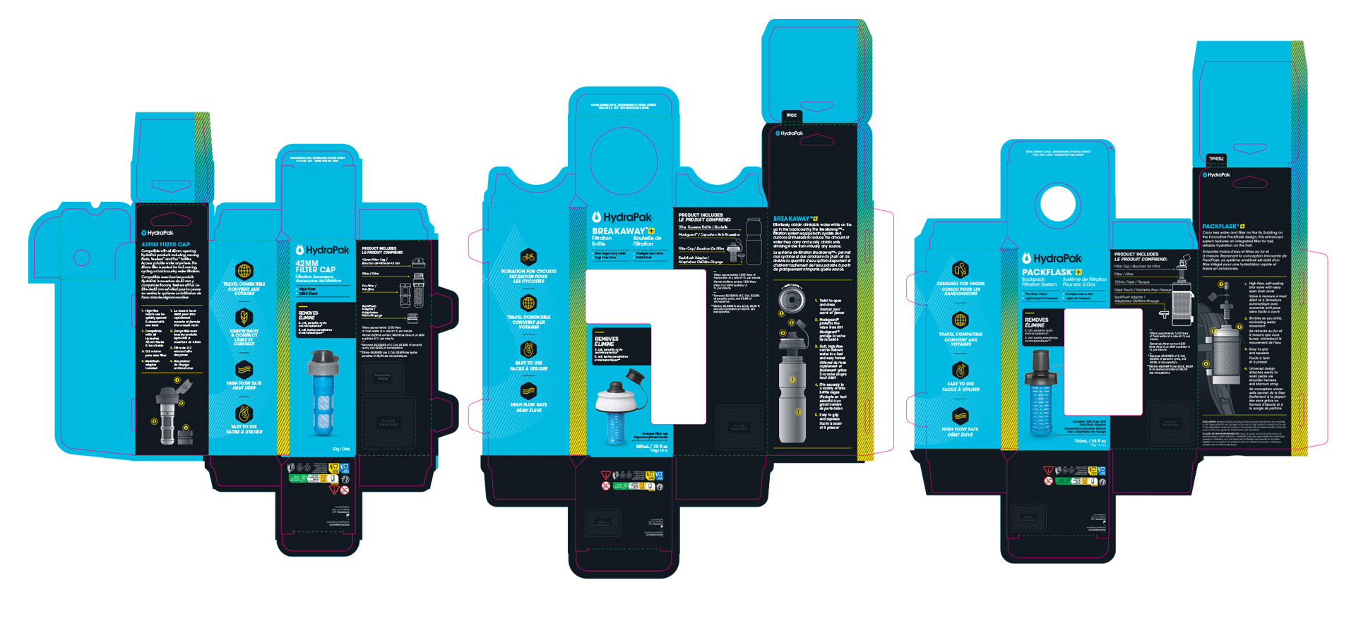
Dieline Types
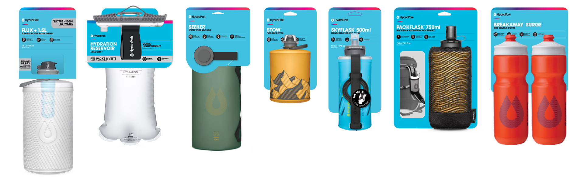
The HydraPak system is engineered for modularity across a diverse range of structural formats. While six primary categories are detailed here, the framework is designed to seamlessly adapt to other existing or future configurations.
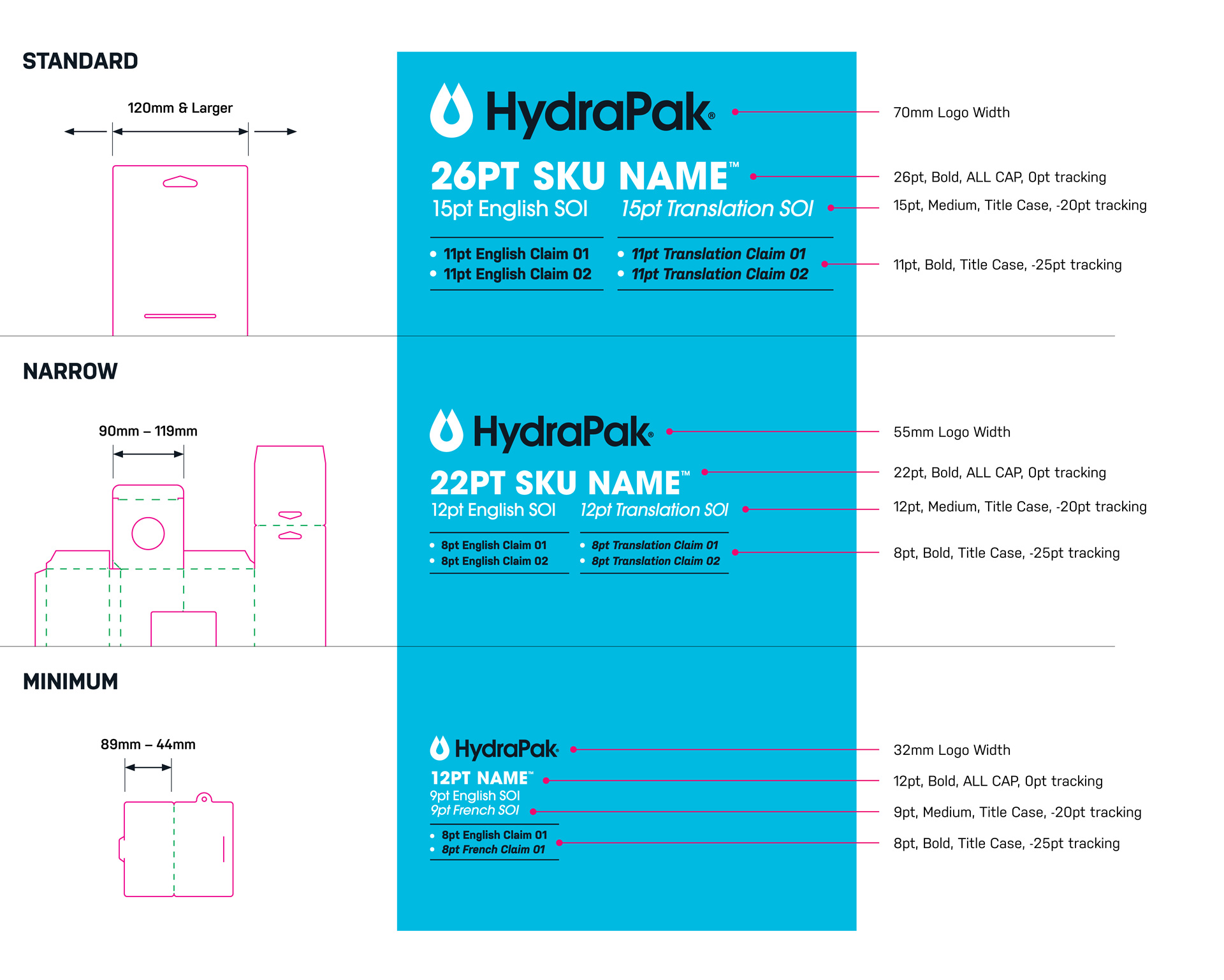
Principal Display Panel (PDP)
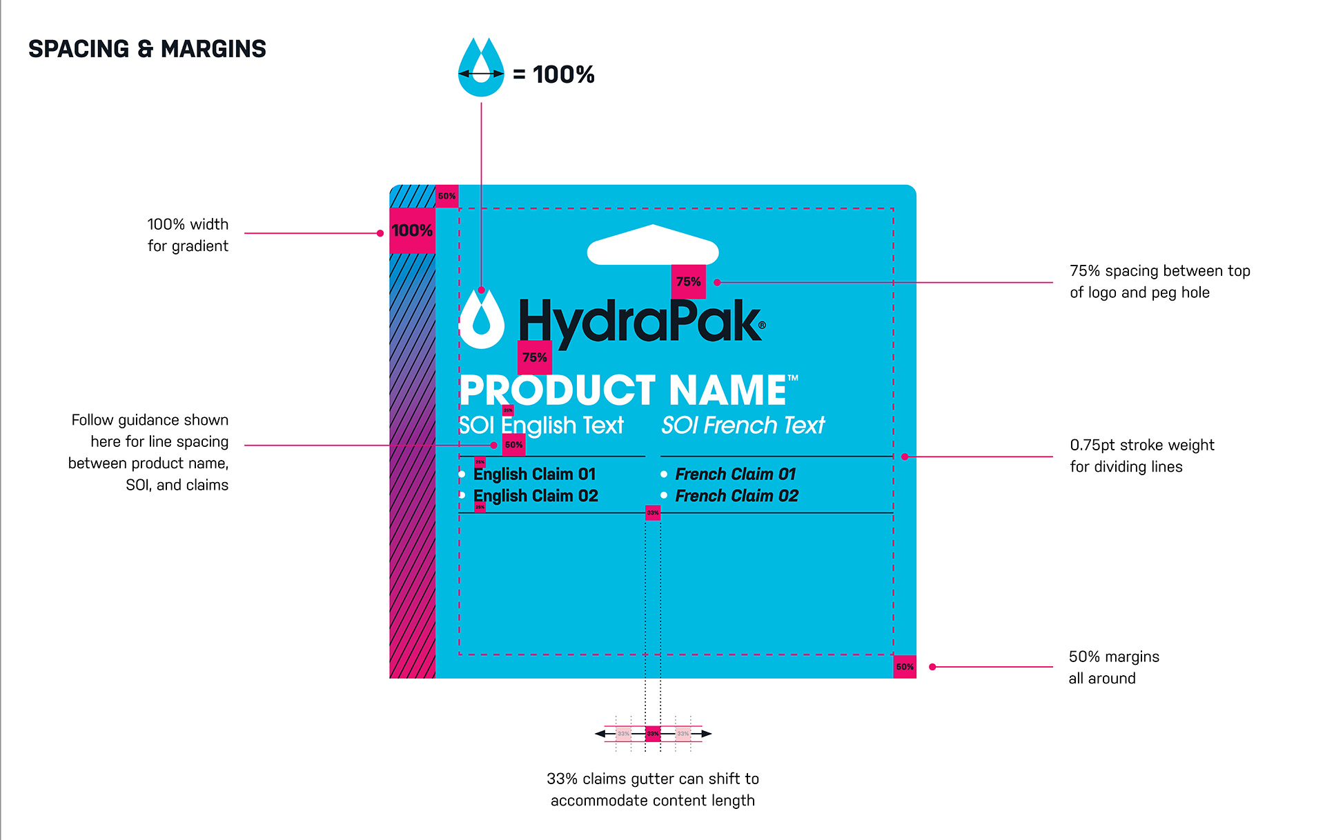
The forward-facing panel of a fully assembled packaged product is called the Principal Display Panel (PDP). The width of this panel dictates the logo size/layout of both the Principal Display Panel and Back-of-Pack (BOP) design.
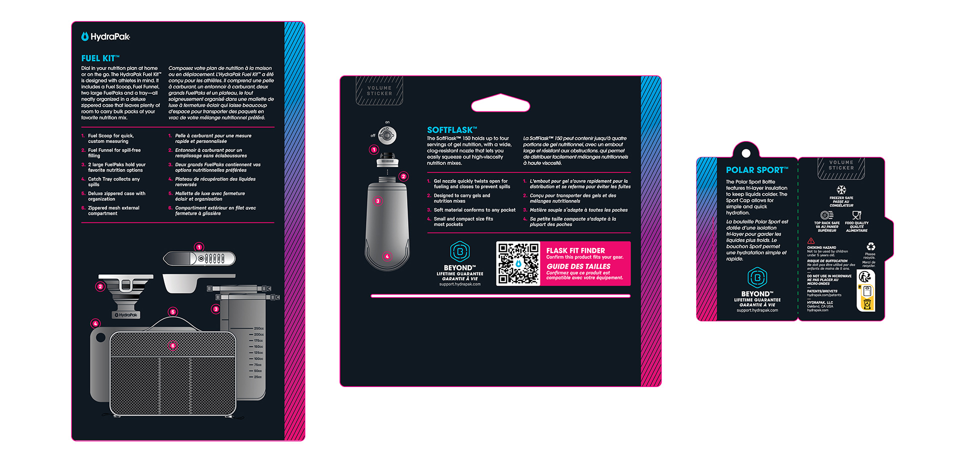
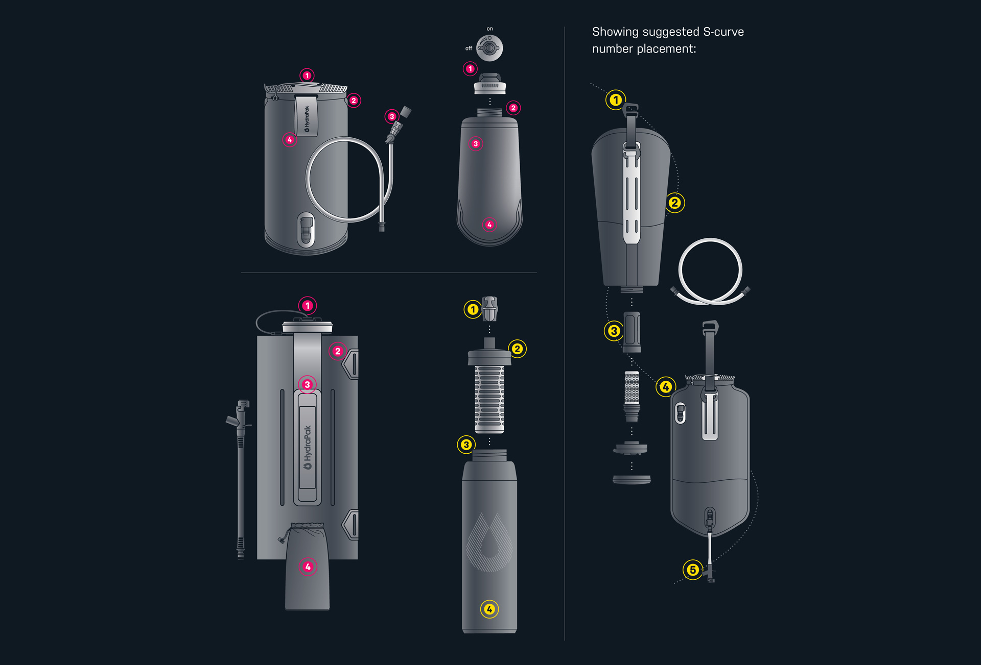
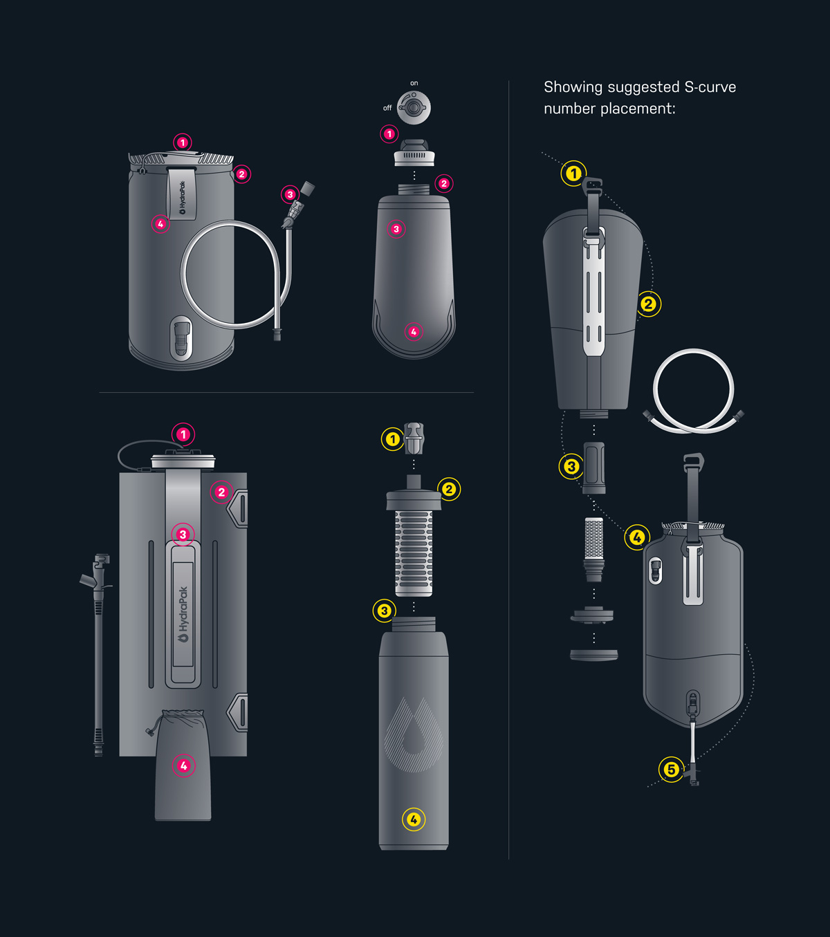
Exploded-View Illustrations
Exploded-view illustrations provide an immediate visual breakdown of product components, features, and mechanical structures. Derived directly from technical engineering drawings, these assets are stylized to translate complex physical items into clean, scannable retail diagrams that support the 1-foot purchase verification zone.
Outcome

Versus testing had a commited preference advantage of +15.2 points compared to previous packaging.

Advantage / Disadvantage:

The difference in committed preference between the two designs. In a redesign matchup, win margins of +4 points or more are highly correlated with in-market post-redesign growth.

68+ new unique, structurally viable dieline solutions for a cleaner retail experience.

Each individual dieline has been categoriezed into three PDP sizes in order to better define layout structure.

Packaging Guidelines, Requirements & SOP's defined and implemented for internal and external production partners.

Design, layout, material and print specifications, sticker emplementaion, assembly, GPSR & Safety requirements and quality assurance have been defined.