

Portfolio
Explore Other Projects
2026
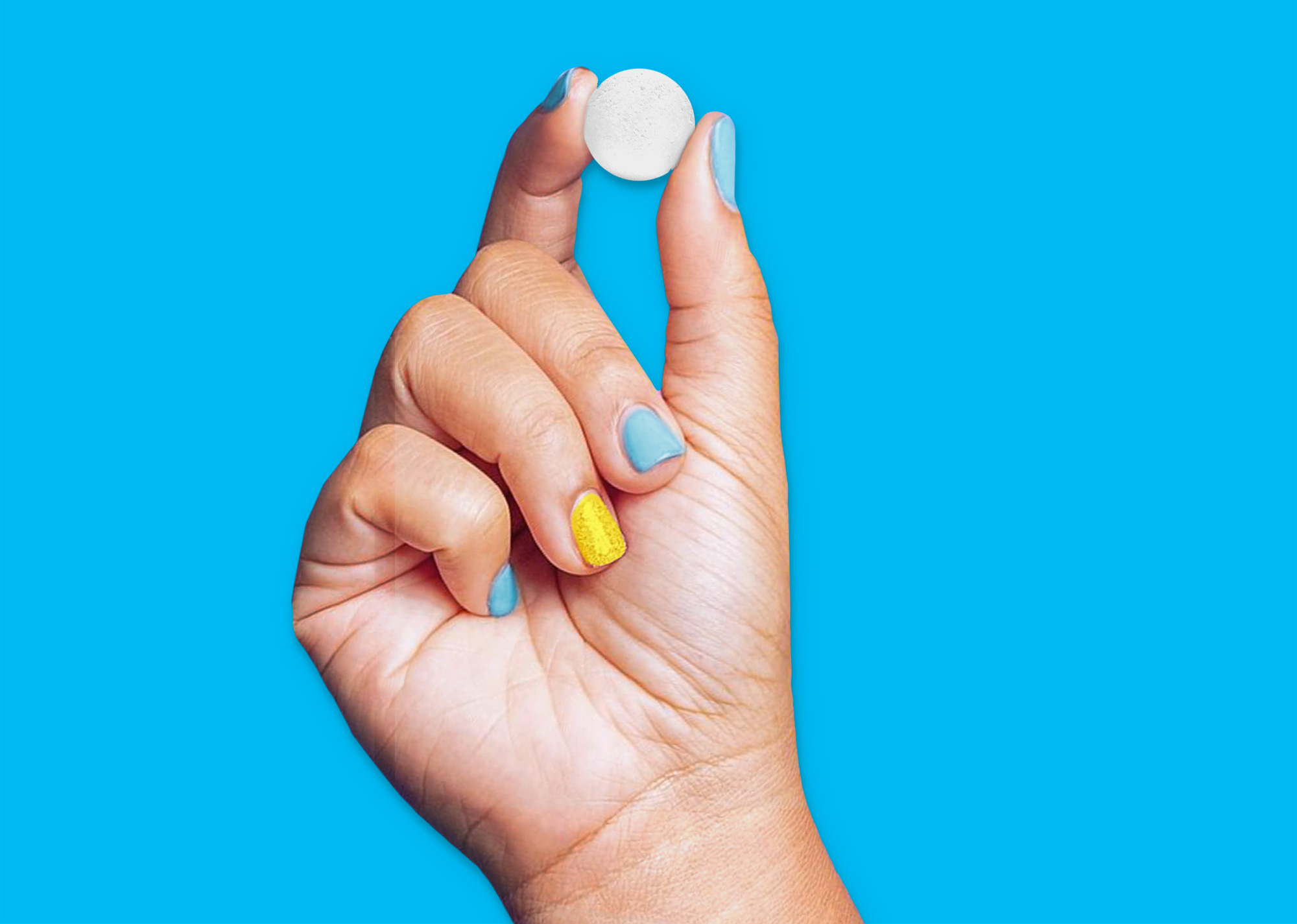
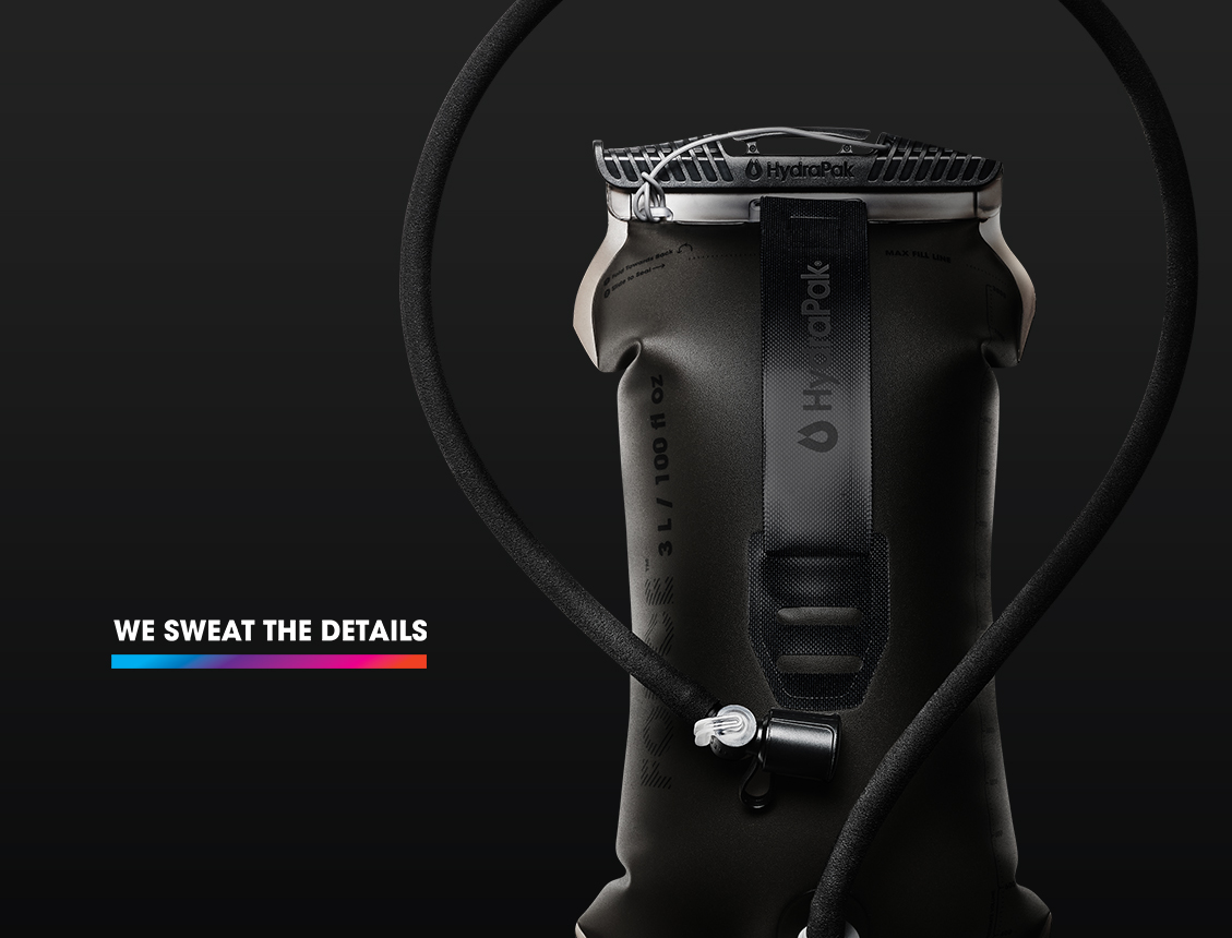
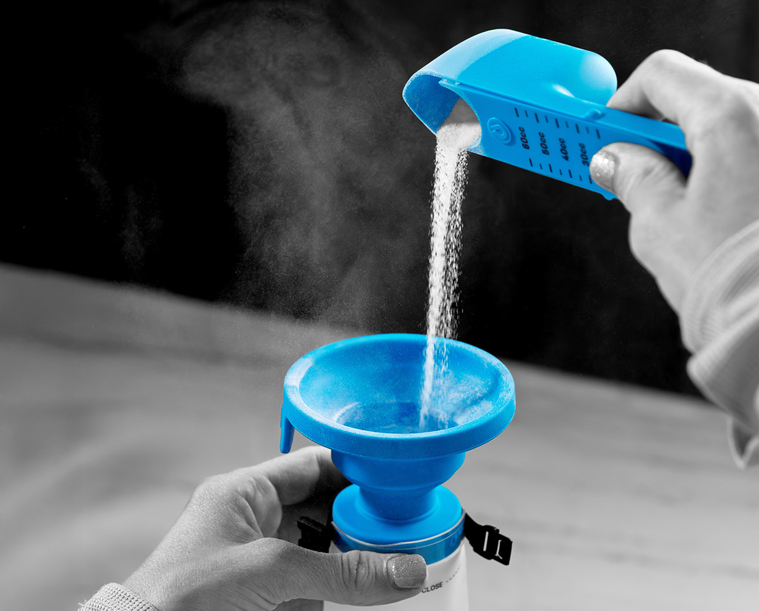
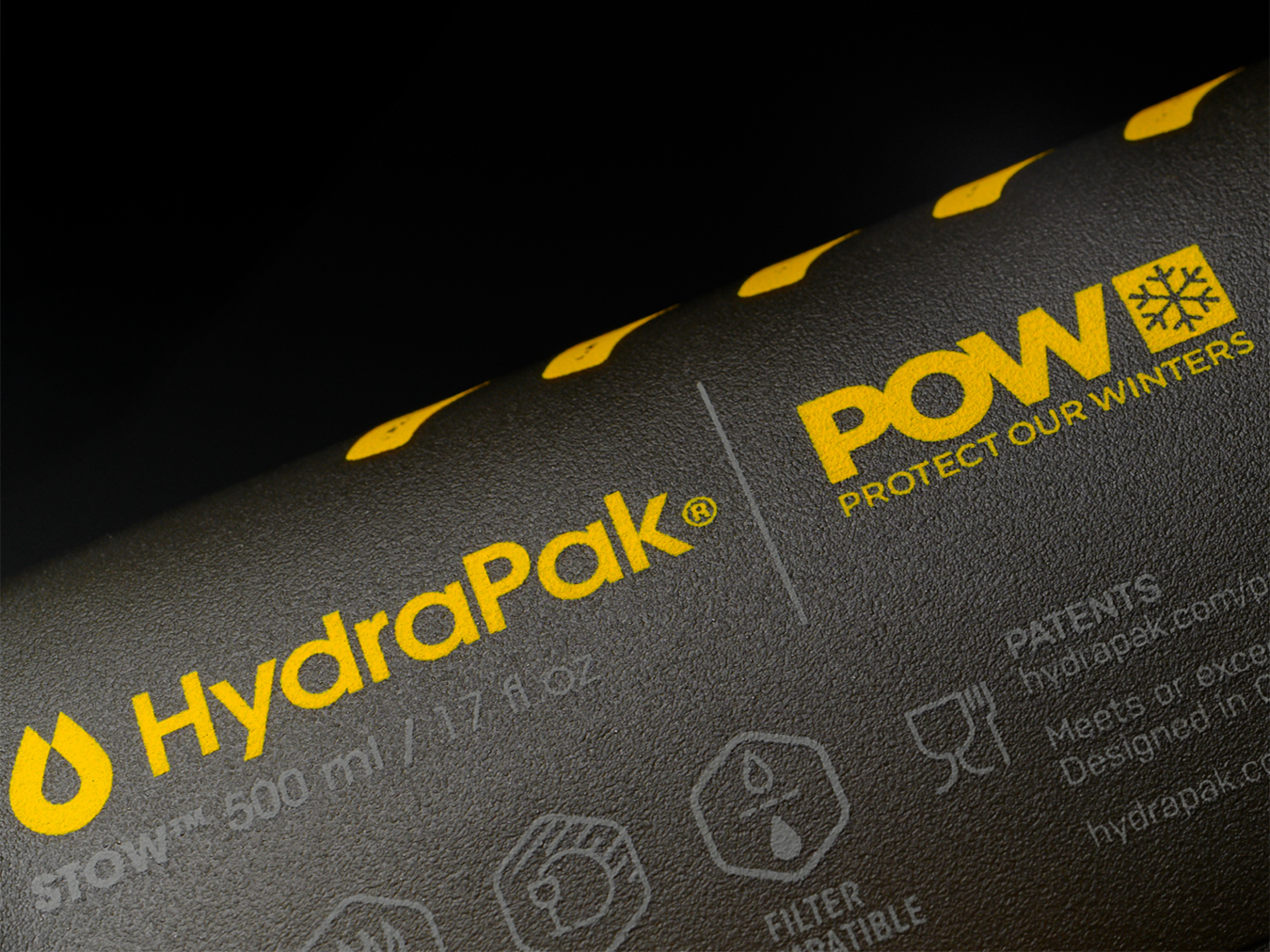
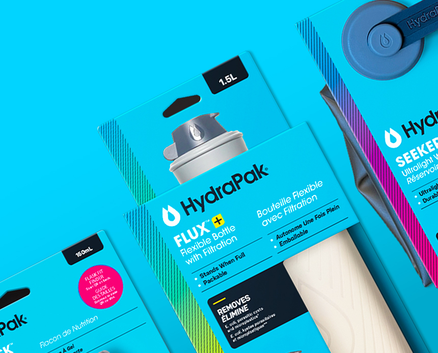
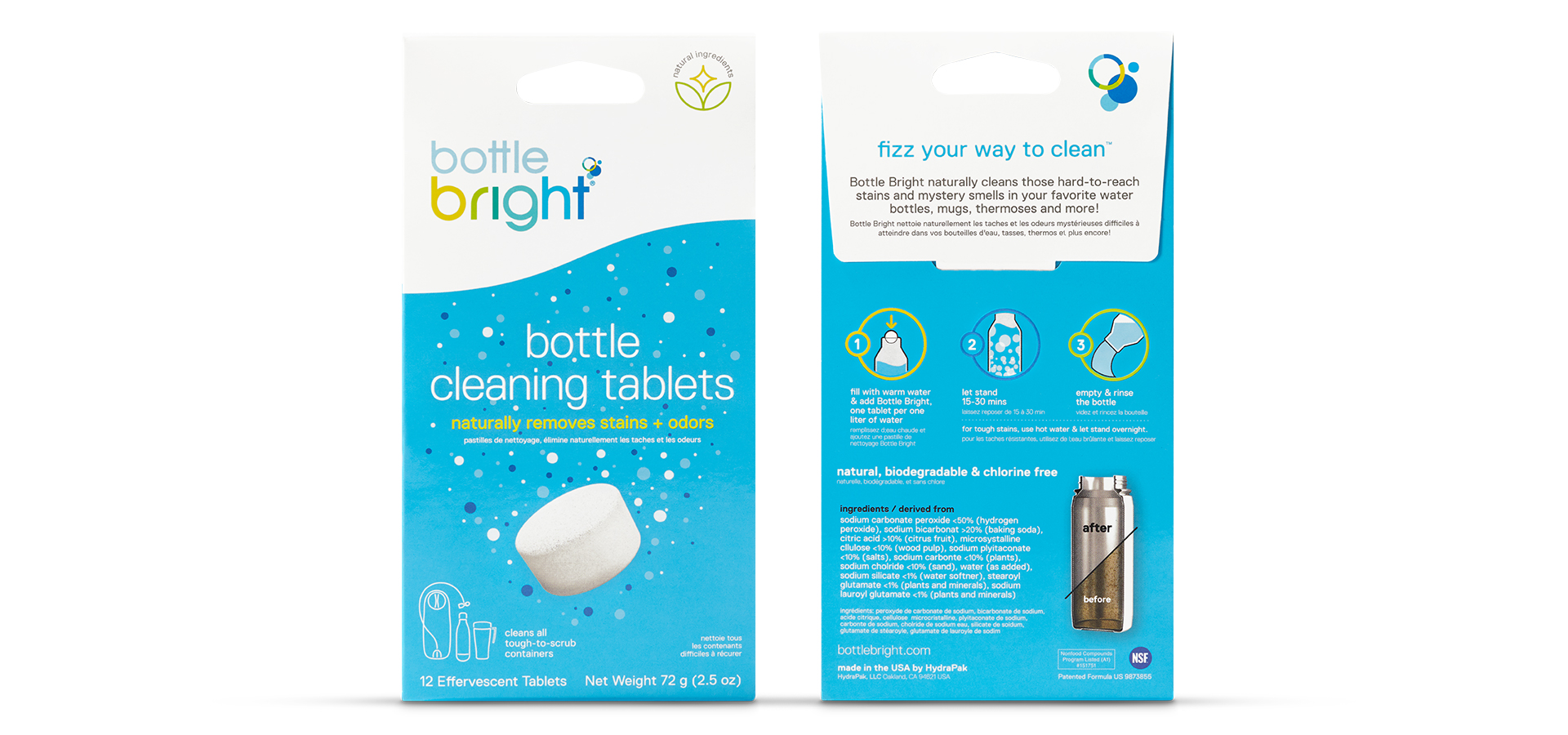
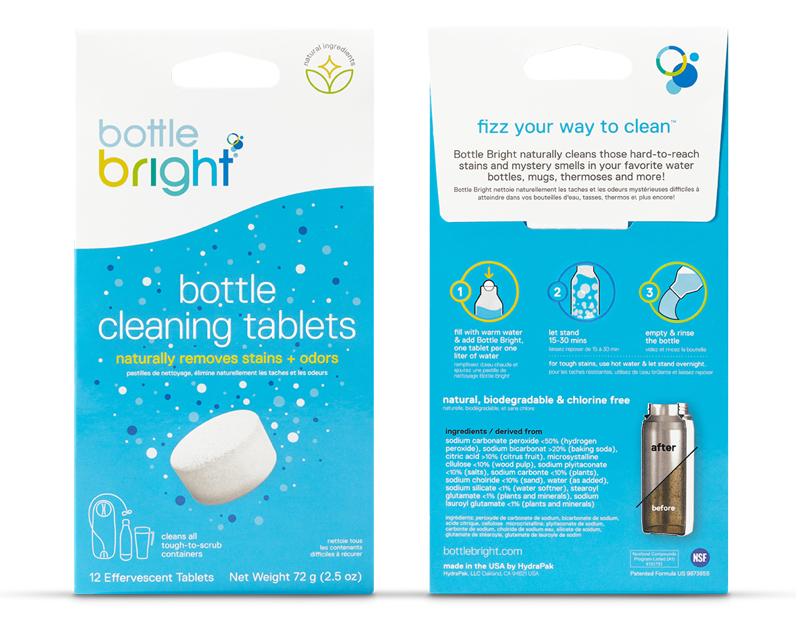
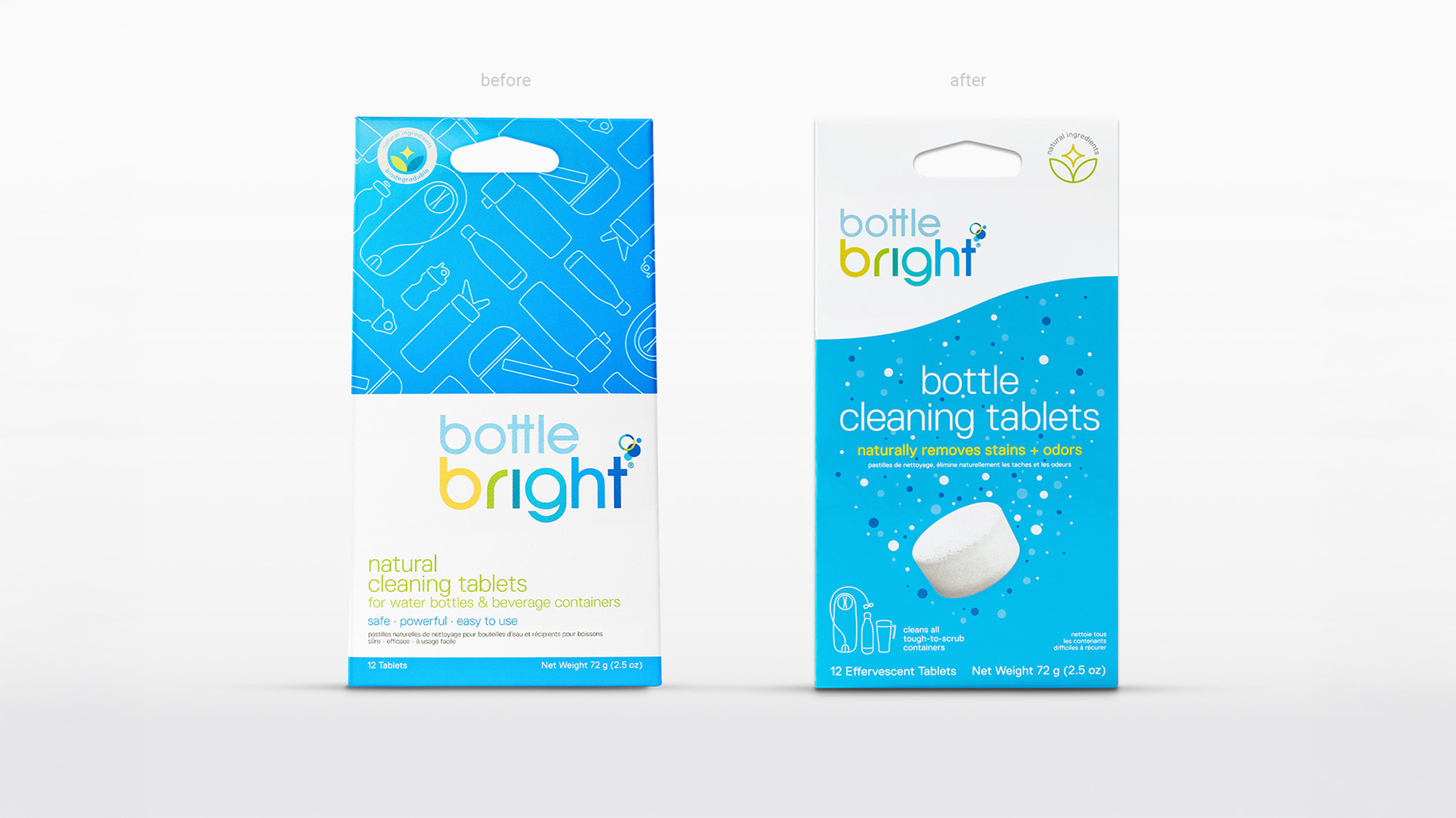
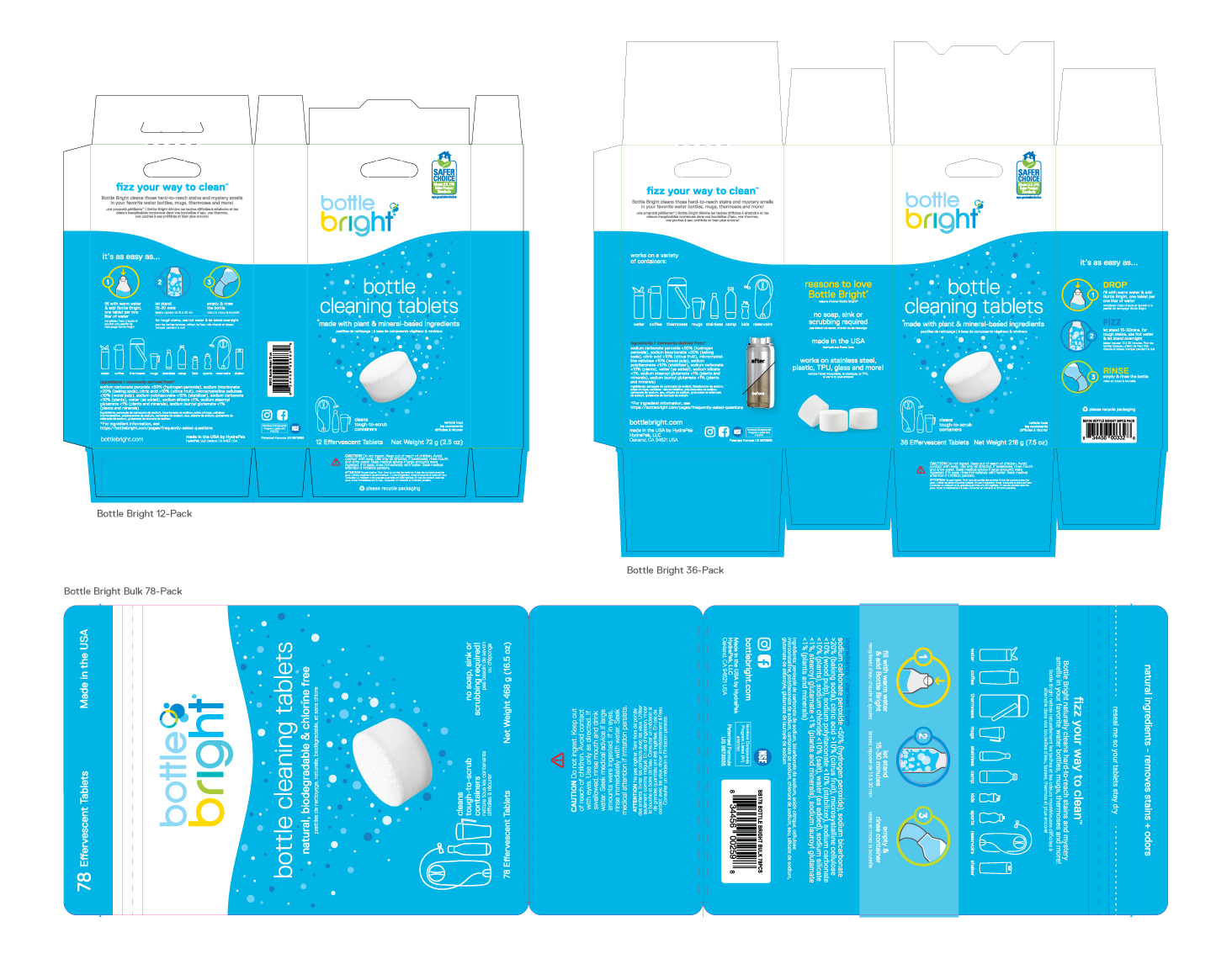
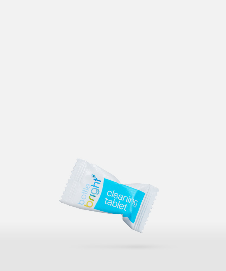
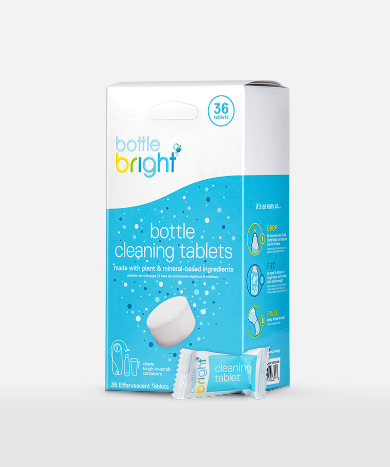
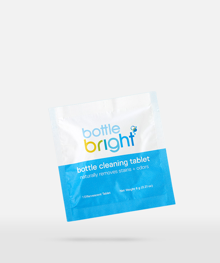
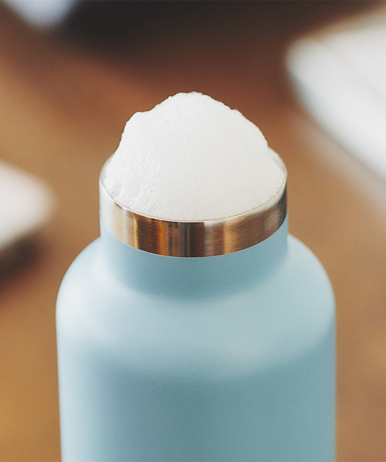
The Bottle Bright packaging redesign focused on making product use more intuitive while creating a stronger, more engaging brand experience. The new system introduced clearer communication, improved visual storytelling, and a more cohesive shelf presence. Beyond packaging, the redesign established a scalable creative direction that could extend across future products, campaigns, and brand touch points.
Project Overview
THE PROBLEM —
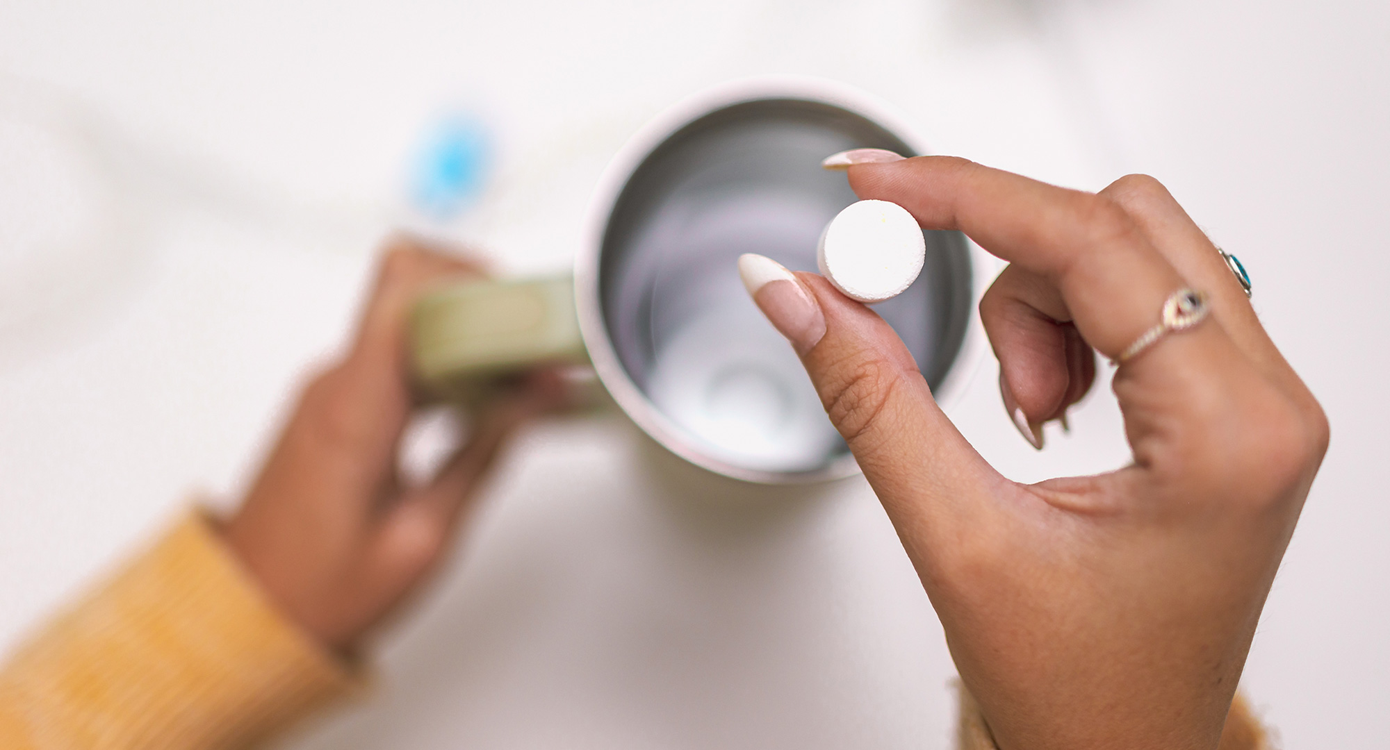
Focusing on the tablet and organizing heirarchy
The SYSTEM —
THE CONCEPT —
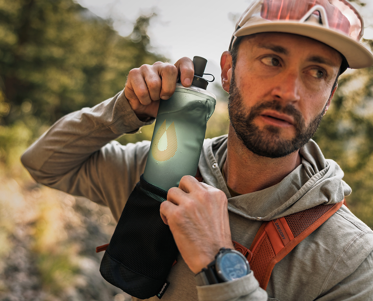
Whether you're charging a summit or ticking off miles, Packflask is hydration that moves with you.






.jpg)